

Hello, fellow ethical spenders and design enthusiasts! I hope you’ve been allocating your resources responsibly and consciously these past few weeks. Today, we’re going to delve into a topic that beautifully marries art and technology – “Advanced Typography in Digital Illustrations.” Typography isn’t just about choosing a font; it’s an art form that can transform your digital creations into masterpieces. So grab your digital pen and let’s dive into the world of typefaces, fonts, and creativity.
The Fundamentals of Typography
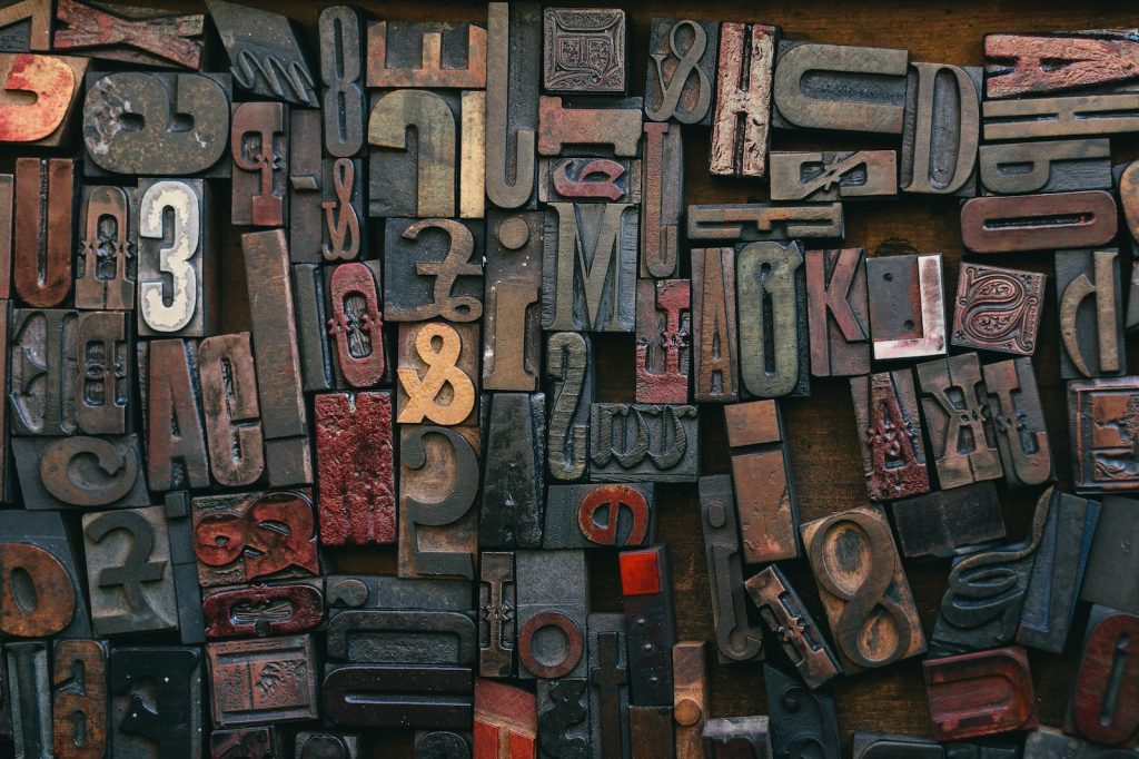
Before we jump into the advanced stuff, it’s essential to understand the basics of typography. Typography is the art and technique of arranging type to make written language legible and appealing. This concept has evolved significantly in the digital age. No more worrying about calligraphy pens and ink blots; we now have a vast digital playground at our disposal.
Let’s start by covering some fundamental aspects:
Typeface vs. Font
Typography revolves around two essential terms: typeface and font. But what’s the difference? Well, imagine typeface as the design and font as the specific implementation of that design. For instance, Times New Roman is a typeface, and Times New Roman Bold 12pt is a font.
Hierarchy
Hierarchy in typography is the arrangement of text elements to guide a reader’s eye. Key aspects to consider are font size, weight, color, and positioning. A clear hierarchy makes your message more digestible, enhancing user experience.
Kerning and Tracking
Kerning is the adjustment of the space between individual characters, while tracking controls the overall spacing between groups of letters. Paying attention to these details ensures the text flows harmoniously.
Leading
Leading is the space between lines of text. Proper leading enhances readability, especially in paragraphs. It can give your digital illustration a more organized and polished look.
Now that we’ve brushed up on the basics, it’s time to explore some advanced techniques in digital typography that can help you elevate your design game.
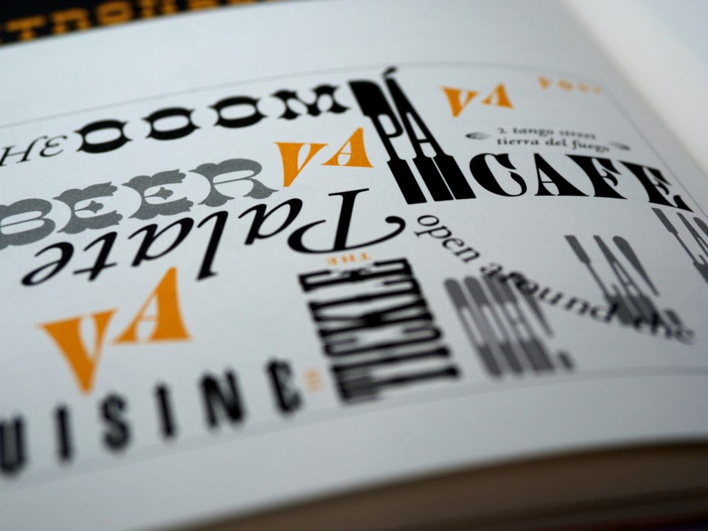
Playing with Lettering Styles
Digital illustration is a versatile canvas. You’re not limited to conventional fonts. Experiment with custom lettering styles to give your design a unique touch. You can hand-letter your text, create decorative initials, or even mix and match different lettering styles to create a distinctive look.
For instance, if you’re designing a vintage-themed poster, you could use a calligraphy-style font for the main text and incorporate decorative elements like swirls or ornaments. This combination adds a touch of elegance and nostalgia to your illustration.
Overlapping and Masking
Typography doesn’t have to be restricted to a straight, linear path. You can create depth and intrigue by overlapping text elements or masking them within the illustration itself. For example, imagine a digital art piece of a forest with the text “Lost in the Woods” winding through the trees. The text becomes a part of the scenery, enhancing the overall visual impact.
Color Gradients
Add a splash of color to your typography by using gradients. Gradients can create a striking visual effect, making your text pop and draw the viewer’s attention. You can experiment with subtle color transitions or go bold with contrasting hues.
Here’s a fun tip: use a gradient to match the colors of your typography to a specific element in your illustration. This subtle connection can tie the whole design together.
Texture and Effects
In the digital realm, you have access to a plethora of texturing and effects options. Consider adding textures like wood grain, marble, or even a watercolor effect to your text. These textures can give your typography a tactile quality, making it visually engaging and adding depth to your digital illustration.
Negative Space
Don’t forget the power of negative space. In typography, it’s not just about what you add but also what you leave out. The creative use of negative space can make your text stand out. Imagine a bold, black headline on a mostly white canvas – the simplicity of it can be breathtaking.
3D Typography
Give your text a three-dimensional twist. You can use shadows, gradients, and beveling to make your typography look like it’s popping out of the screen. This technique is perfect for eye-catching titles or headings in digital illustrations.
Responsive Typography
In the age of responsive design, it’s crucial to consider how your typography will adapt to various screen sizes. Use scalable fonts and CSS to ensure your text looks great on both desktop and mobile devices.
Hand-Drawn Typography
Hand-drawn typography has a unique charm. It adds a personal touch to your digital illustrations. You can scan your hand-drawn lettering and then incorporate it into your digital designs. This approach is particularly effective for brands or projects aiming for a more human touch.
Animate Your Typography
Want to take your digital illustration to the next level? Add some motion to your typography. Animating text can add a dynamic and captivating element to your design. Think about how a subtle fade-in, a bouncing effect, or a typewriter-style text reveal can enhance the viewer’s experience.
Variable Fonts
Variable fonts are a relatively recent development in typography. They allow you to adjust various aspects of a font, such as weight, width, and slant, with a single font file. This innovation offers immense flexibility and can be especially useful for responsive design.
Putting It All Together
Before you start incorporating these advanced typography techniques into your digital illustrations, remember that restraint can be just as effective as extravagance. Each design project is unique, and the choices you make regarding typography should serve the overall message and theme.
Consider your target audience and the mood you want to convey. Typography is a powerful storytelling tool, so choose your fonts and styles wisely. And don’t forget to proofread your text; nothing spoils a beautiful design like a glaring typo.
So, there you have it, fellow ethical spenders and creative minds. Typography in digital illustrations is more than just choosing a font; it’s about crafting a visual language that complements your message and captivates your audience. As you embark on your design adventures, remember that the art of typography is ever-evolving. Stay curious, keep experimenting, and don’t be afraid to break the rules – that’s where the magic happens.
Happy creating!